This content of this site is still in development.
Navigation
The V2 template has a few small changes to how navigation behaves.
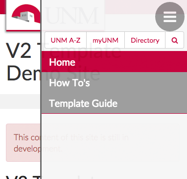
Mobile Menu
As the browser window gets smaller (less than 768px wide) the menu will convert to a Mobile Menu in the top right hand corner of the screen. The mobile menu icon or "hamburger button" look like 3 horizontal lines. Clicking the button will cause a menu to slide out from the side of the screen.
Horizontal Navigation
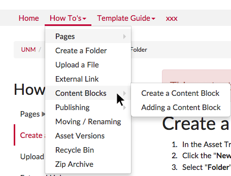
By default sites are setup with a horizontal navigation bar that has dropdowns. This menu services as the primary navigation of your site and should typically stay consistent across all pages. The menu can go multiple level deep to provide the user quick options to find what they want. We have address a few usability issues with this new menu.
- Edge Detection - the website will determine if the any submenu is going to go off of the side of the screen and reposition it so that it remains visible on the screen.
- Diagonal Mouse Movement - We have implemented a small delay in submenus closing when the mouse moves in a diagonal direction to a submenu item. This should allow users to more easily click the item they want without the menu disappearing.
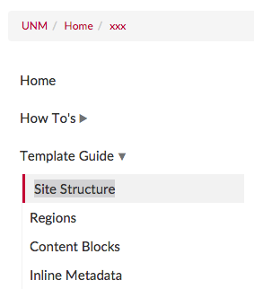
Sidebar Navigation
Website will also have a sidebar menu. Some sites may choose to hide the sidebar navigation on the homepage to avoid duplication. When you create folders within your website and mark those folders to use "contextual navigation" the sidebar menu will show navigation relative to that folder for all the pages inside. This allows for greater flexibility and ease in managing your site. Sidebar Navigation will move to the mobile menu when a screen is smaller.